Saberscope
BRAND IDENTITY | BRAND LANGUAGE | BRAND ARCHITECTURE
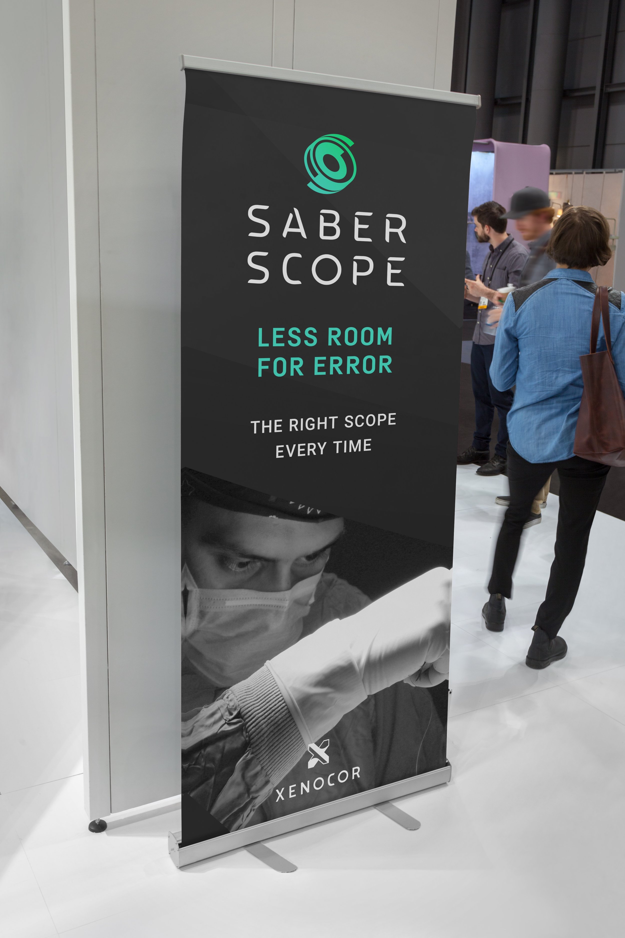
Xenocor, a startup medical device company excelling in innovation, created Saberscope, a laparoscope and brand ready to disrupt the single-use laparoscope market by leading with innovation, boldness and precision. Saberscope was in need of a brand identity refresh to better communicate the above attributes and to help lead the way for industry-wide adoption; all while competing in a market full of medical device giants which come with their own tired identity cliches. To help Saberscope and Xenocor break these industry cliches, I designed and art directed a refreshed identity by utilizing a bold and precise logo mark and logotype, along with patterns, color palettes and typography to convey technical expertise and innovation.
Agency: Duffy & Partners
Creative Director: Joseph Duffy
Strategy: Nancy Kullas
Project Manager: Bridget Duffy
Designer & Art Director: Matthew Sullivan


