


1
2
3
4
5
6
7
8
9
10
11
12
13
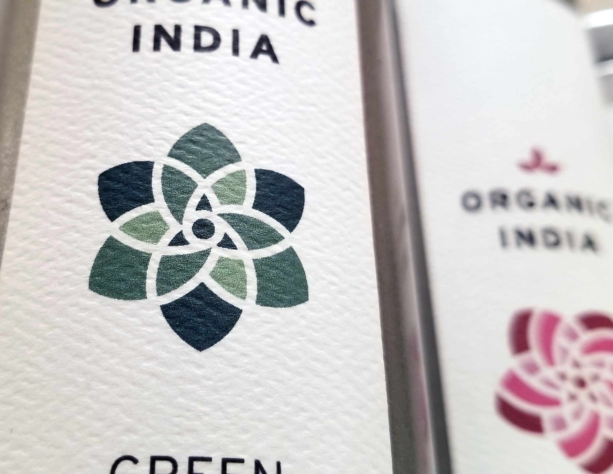
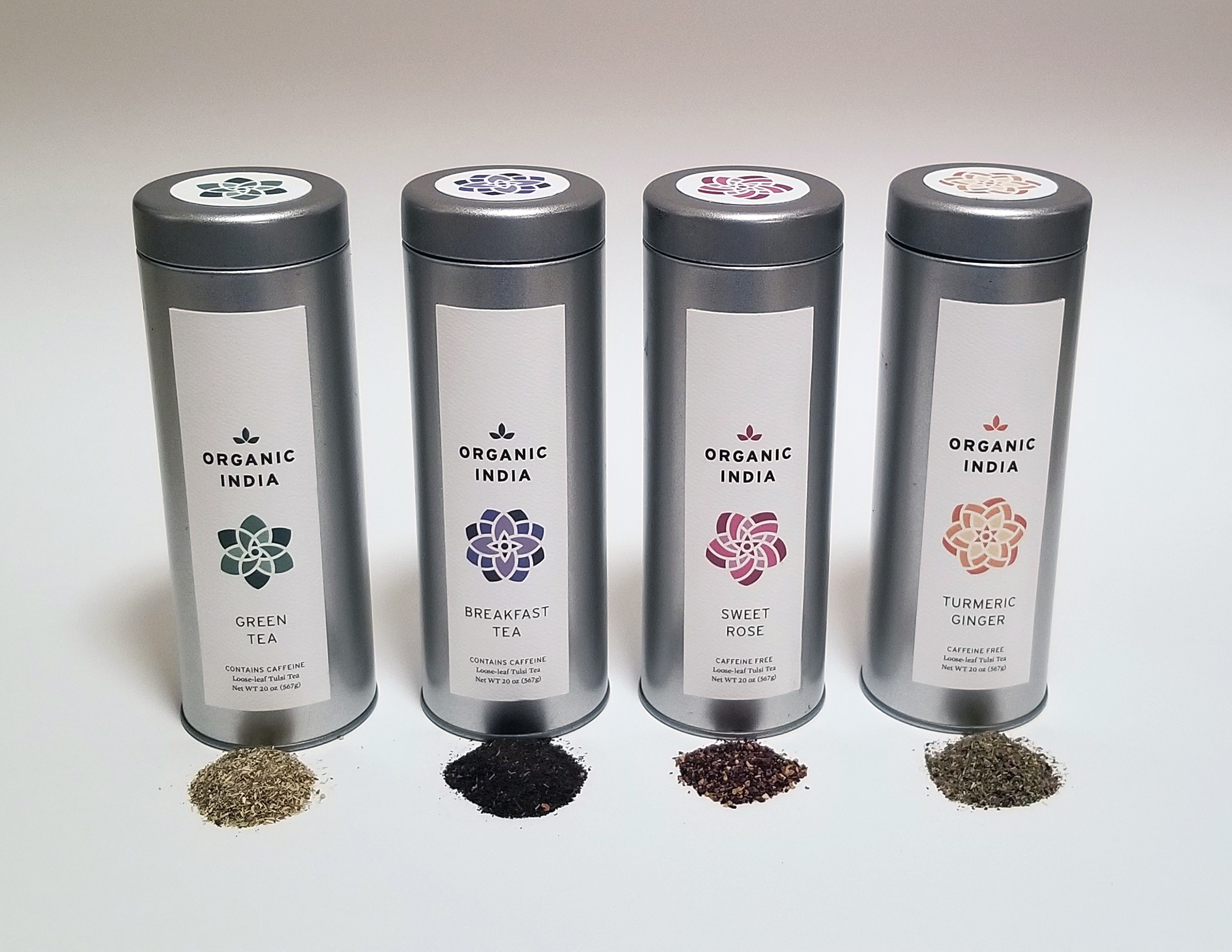
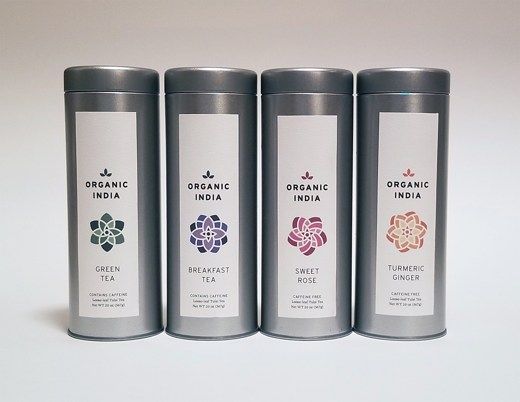
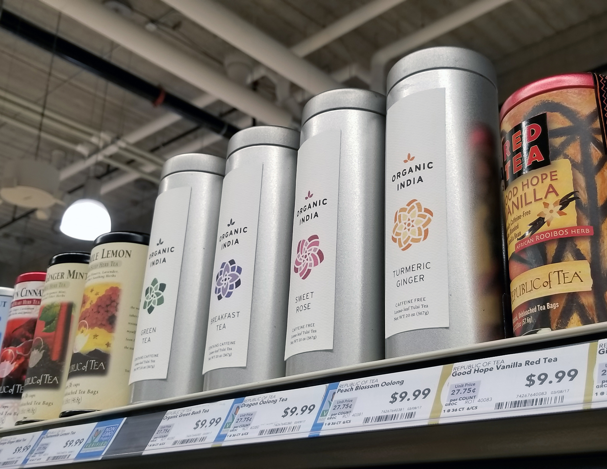
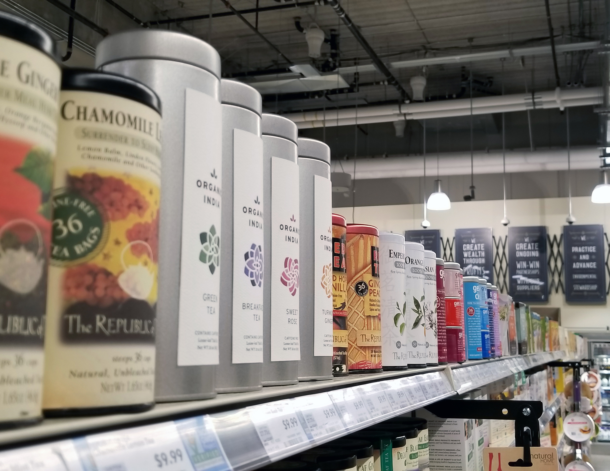
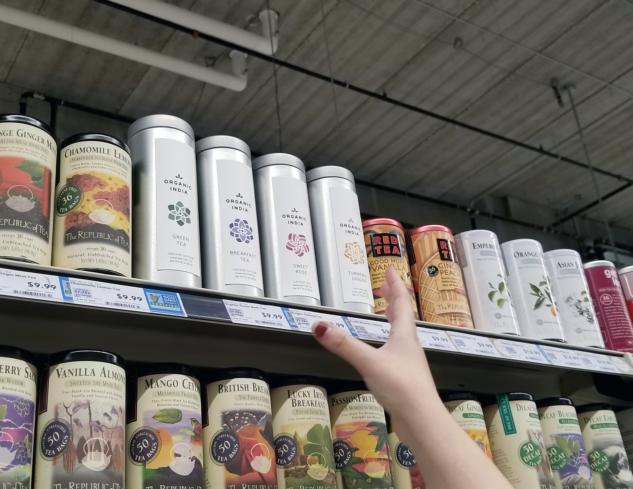
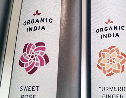
This Organic India Tea Repackaging project was a package emphasized project in which we had to re-brand an already existing product. I chose the Organic India Tea brand and packaging due to the original packaging needing a serious design rework. With my approach, I recognized the busyness of the tea isle in grocery stores and created a contrasting minimal aesthetic to the packaging. This minimal aesthetic approach resulted in a sophisticated final product that utilized my typographical and iconographic abilities incredibly successfully.
Click here to view the in-depth case study. This case study includes research, visual inspiration, sketches, and drafts.